One presentation really doesn’t fit all situations. Depending on the room, the setting, the purpose of your upcoming presentation, the slides have to be optimized. Your preparation will differ. This is a quick guide to how three different settings effects three aspects of your presentation.
Slides for seminar setting
Contrast – avoid being a shadow
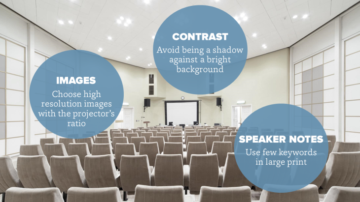
In a dark conference room, slides with a white background will be really bright and you might appear like a black shadow in front of them (and you do want nice pictures on Twitter from your presentation, don’t you?). Make sure the color of the slide background fits the lighting of the room.
Images in the right size
Images are always important (one picture is worth more than… you know… yada yada yada) – but in a seminar setting they will have an even bigger impact. You have to choose images carefully. Use only high resolution images (please, please, don’t take them off Google Images!)
Make sure your presentation has the same aspect ratio as the projector (so your pretty 4:3 presentation isn’t stretched and all your great images are being shown in an unplanned 16:9 view).
Speaker notes and practice
If you’re presenting in a seminar setting, maybe even when your face is up on a side screen, your speaker notes needs to be larger and shorter – probably only keywords. You need to have practiced and practiced again (unless you plan to stand behind a podium and read from a script and getting pictures of your top of your head on Twitter, while they go hard your presentation skills). Every “uhm” and “so” becomes more obvious on a seminar stage.
Slides for workshop setting
Are you ready for improvisation?
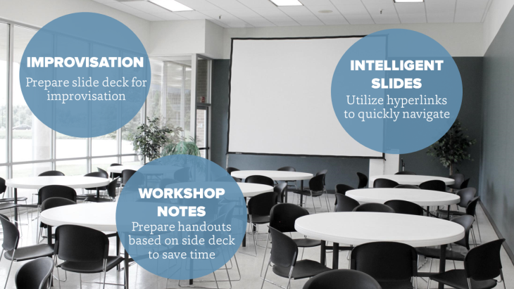
Workshops are, if done right, a explorative maze of great conversations. Regardless of your planning, workshops outcome are usually not very linear (workshop attendees have the annoying habit of bringing up subjects you had plan to present on slide 54).
You need to be able to improvise live and your slide deck needs to work for improvisation (nice, slow slide transitions might not be the best when you quickly have to move from slide 2 to slide 54).
Intelligent slides
Being able to move around your slide deck quickly also calls for a very different navigation setting of your slides. You might need to connect different decks and move seamlessly between them without losing time – or focus. You might need to move quickly between different parts of your presentation. This is a great time to learn you to utilize the hyperlink function in your presentation software.
Prepared workshop notes
You probably want the participants to have notes from your workshop even though you can’t be sure where the workshop conversations will take your presentation. You might want to prepare ahead and create a practical handout template which will accommodate notes and sketches from your presentation – while still using the carefully crafted outline in your workshop slide. Or bring along a coworker who continuously through the workshop can make notes directly into a prepared template, ready to be distributed electronically right after the workshop.
Slides for formal setting
The Smart Intro
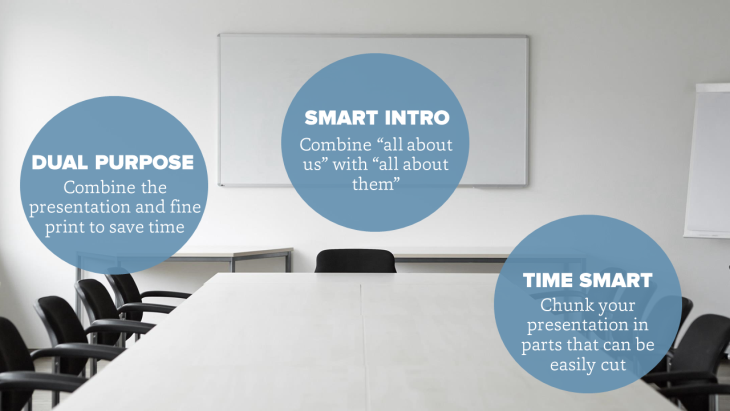
When meeting a prospective client or partner for the first time most people tend to want to divulge into the “About us” slides to legitimize themselves and the reason they have been invited. But most often the prospective client or partner actually knows your company- they might have been the ones to invite you. This is a good time to learn how to do a smart intro – how to connect your “about me”-slides to the “about the client”-reality and keep it short, simple and engaging (an un-smart intro is the ones where the default “About us” slides are all about us, us, us).
Time smart presentations
Even though you did think you had 60 minutes to prepare, the client was late coming in, introductions and chit chat took place and the client has to cut the presentation short and you end up with 15 minutes to present.
Is your presentation time smart? Do you know how to cut it short without stressfully clicking away with the clicker (because you did bring one right?), while watching the slides go by faster than a high speed train?
Dual purpose presentation slides
Often the prospective clients want to have your slides and you want to save time – so you’ve crammed a lot of info on your sides (really they’re probably more a document in slide mode than a presentation). This is the time when you have a great handout template with all information and the fine print added, while still presenting nice, pretty, story focused slides and leaving the small text for reading later. You can even save your slides as a pdf from the handout mode and everything will be there when you hand it over to the client (or beam it with your super connected device).