Colors are all around us. A picture is worth more than a thousand words. Sometimes it’s the colors of a picture that speaks to us and resonates and tell a story. Maybe you want to capture that color story and use it in your next PowerPoint presentation. This is a guide in 5 steps on how to create a presentation color theme from a photo.
1. Find an image
Find an image with colors you like or take a picture or a screenshot of a design or image with color combinations that are exciting. If you see the image online, save the url to your Evernote, pin the image to your Pinterest or download the image to your computer or to a Dropbox, Box, Google Drive folder. If you find it in a magazine, take a photo of the image or scan it and save it. In other words, save it so you can find it.

2. Use online resource to pick colors
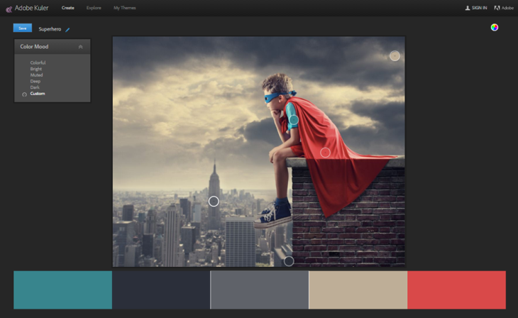
Upload or link the image to a color processing site. There are several great resources available for free online to help you with color scheming. We like Adobe Kuler and ColorLover but there are other out there that do a similar thing. Adjust the colors and create a palette you like. You can also color pick an image you’ve inserted to PowerPoint 2013 or using other photo software of course, but these online services are very quick to use compared to work inside PowerPoint.
Make sure you get the RGB color codes for your chosen colors – you will need these when you add the colors to PowerPoint. Don’t forget to think about contrasts – a presentation color theme need good contrast – especially if it’s going to be used in charts or smart art. Some colors are trickier to use when using a projector – like yellow and light grey, so avoid these.
3. Optimize colors for PowerPoint
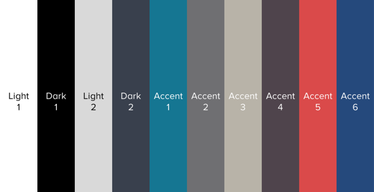
Now you need to optimize the color palette for PowerPoint. You need ten colors for a PowerPoint color theme – six accent colors and four background/text colors. Most of the color websites will give you five accent colors – so first you need to add an accent color. You can do this by first saving your color palette and then adjust or add one color to get six accent colors.
You also need to add a dark and a light background color and a dark and a light text color that goes well with the six accent colors. To make it easy and to almost never go wrong – use black and white for two of these and pick two additional colors for the remaining two. Your six accent colors need to show on your background colors, so don’t go to crazy and make sure you test it out if you are unsure.

4. Create a color theme inside PowerPoint
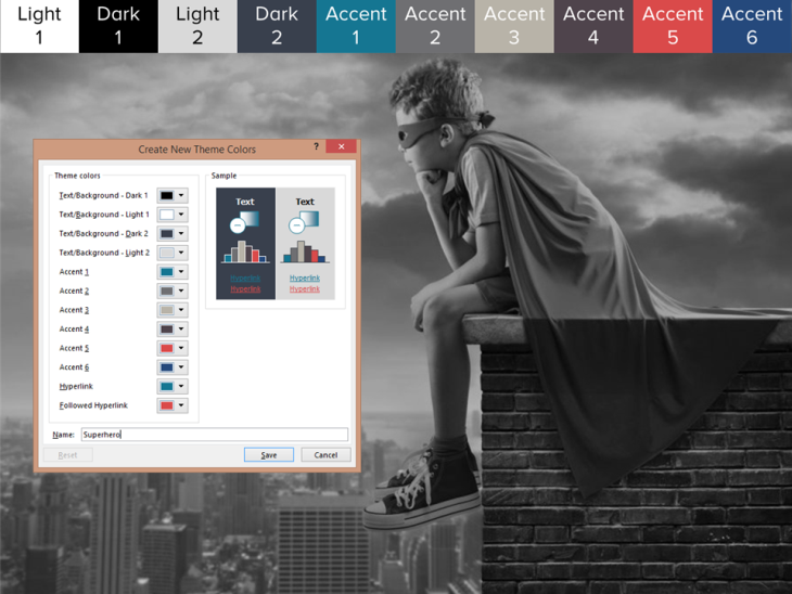
Create a new color theme inside PowerPoint using your new colors. Open the color menu under the design tab and choose customize colors. Add your colors by adding their RBG color codes. Think about the order of your color to make sure you get good contrast in charts (if you have a light blue and a darker blue – maybe add other colors in between so they don’t are shown next to each other in charts etc). Check the order of your dark/light background and text colors (if you use black and white, we suggest you use white for your Light 1 color and black for your Dark 1 color). When you are done, give your color theme a name and save it.

5. Apply your new color theme
Now you can apply this color theme on any PowerPoint presentation you open or create a new template with the color theme. Tada!

So, you might wonder, do you really need to go through the hassle of creating a color theme? Can’t you just color pick the colors (and inbuilt function in PowerPoint 2013) from an image you insert? If you really want to utilize the smart use of color themes and have your colors readily available for any graphic object the answers is: yes, you really need to create a color theme and it will save you time down the road. By saving a color theme you will also have it available for any other presentation you will create in the future, and not just a locally used color in a presentation file.
Leave a Reply