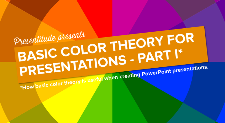
The 12 colors in the color wheel can be combined in different ways. Some of the colors are considered warm, and some cold. Some are considered be complimentary in different ways. Colors next to each other are called analogous and using the same color and its tints tones and shades is called monochromatic. We can […]
The basics of the color wheel for presentation design (Part I)
Colors are just as important as the content of your presentation. The chosen colors will, if used right and consistently, help enhance your message. You need colors to create a theme that flows through your presentation. You want to utilize different colors for different content and help the audience follow your communication. Knowing the color […]
10 ways to avoid death by bullet points
The concept of Death by PowerPoint has largely been blamed on the over use of bullets in presentations. It’s somewhat sad as bullets are a great way to organize content and create a structure. If you are structuring a to-do list for your next project – you will most likely use bullets as an organizing […]
3 presentation color themes based on Marsala
Pantone, the global authority on color, has introduced Marsala as the color of the year 2015. Pantone describes Marsala as an earthy shade with a bit of sophistication and says that “Marsala enriches our mind, body and soul, exuding confidence and stability. Marsala is a subtly seductive shade, one that draws us into its embracing […]
How to use a presentation template to save time
“I really don’t want to spend time making a template, I’m just going to do a quick [insert medium here] presentation”. We hear this a lot. It might seem like a time saver in the short run, but as soon as you’ve gone beyond 3-4 slides, you will benefit from using a template – even […]


