Colors are just as important as the content of your presentation. The chosen colors will, if used right and consistently, help enhance your message. You need colors to create a theme that flows through your presentation. You want to utilize different colors for different content and help the audience follow your communication. Knowing the color theory basics and how PowerPoint handle colors will make it easier to use colors in your next presentation.
The basics of the color wheel
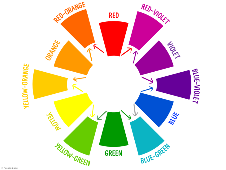
The color wheel was the first organized system of colors. It is still used to illustrate the relation between colors.
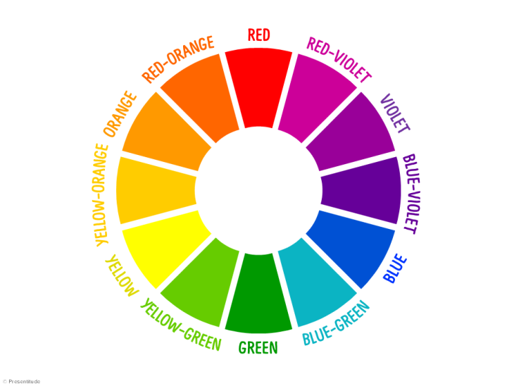
In traditional color theory, it all starts with three colors – the primary colors.
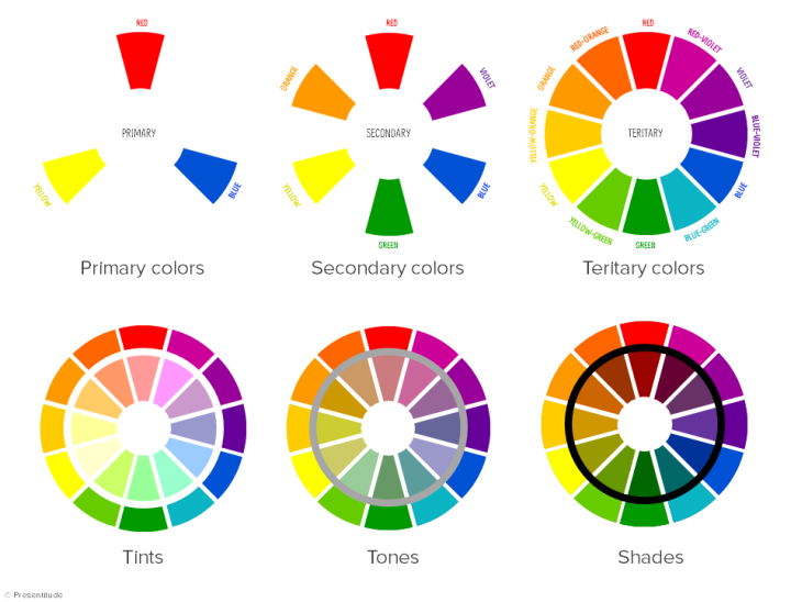
The PRIMARY COLORS on the color wheel are red, yellow and blue.
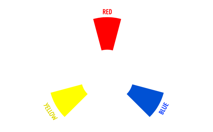
The SECONDARY COLORS are orange, violet and green. They can be made from mixing two primary colors.
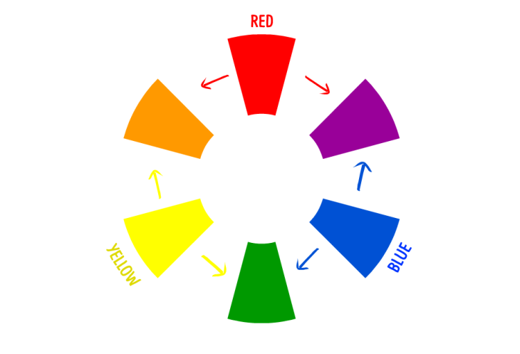
The TERTIARY COLORS completes the color wheel to 12 basic colors. The 6 tertiary colors are created by mixing one primary color with an equal part adjacent, secondary color.
The colors on the color wheel can also be described by its tints, tones & shades depending on if you blend them with white, gray or black.
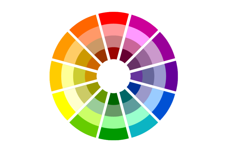
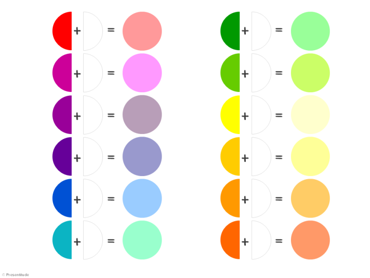
A color TINT is a hue blended with white.
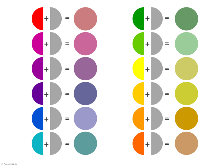
A color TONE is a hue blended with gray.
A color SHADE is a hue blended with black.
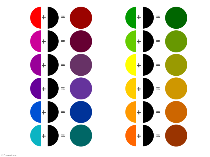
Why is black or white not on the color wheel?
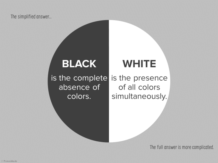
The simplified answer is that black is the complete absence of colors and white is the presence of all colors simultaneously. The full answer is more complicated – are black and white colors, are they generated by light or do they exist as pigments or as molecular coloring agents (read more here)? So we’ll stick with the simplified answer and conclude that white and black are not included in the color wheel.
What about brown?
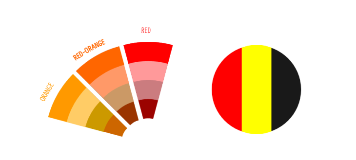
Brown is a dark orange or neutral red hue a composite color made by combing red, black and yellow.
In sum
Read the other parts in our Colors for PowerPoint series:
View this post as a slide presentation:
