When you are creating PowerPoints and choosing a font you have to make your selection carefully. Not only because fonts are communicating a feeling and a mood for your presentation, but also for practical reasons. There are only 40-something fonts that are safe to use if you want your PowerPoint to show correctly on any computer or in any version of PowerPoint (read more about these fonts here). Six of these “safe” fonts are the six “C-fonts”.
The six C-fonts
In 2002 Microsoft commissioned six new fonts to be introduced with the Microsoft Vista system. They were all named with the beginning letter C as they were to emphasize that they work well as ClearType fonts (a technology introduced by Microsoft in 2002 to render text in a font system) and are part of the ClearType Font Collection. The C-font collection consist of three sans-serifs, two serifs and one monospaced font. Let’s explore them as potential fonts for your next PowerPoint.
The six C-fonts are Calibri, Cambria, Candara, Consolas, Corbel and Constantia.
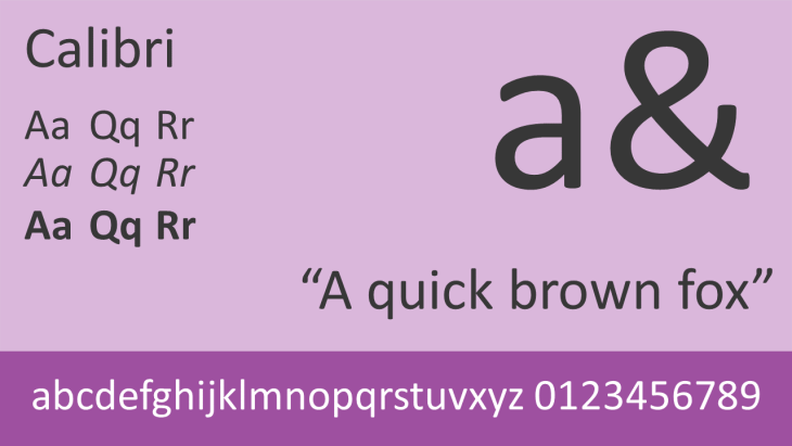
Calibri
Calibri is a sans-serif font designed by Lucas de Groot and has subtly rounded stems of the letters. It replaced Arial as the standard font in Microsoft PowerPoint from Office 2007 and forward. Those using Windows 8 and up has access to Calibri Light, a thinner version of the regular Calibri. As Calibri is the default font in all versions of Microsoft Office and Word, it is now one of the most used typeface families in the world (which might be one reason you want to use another font…).
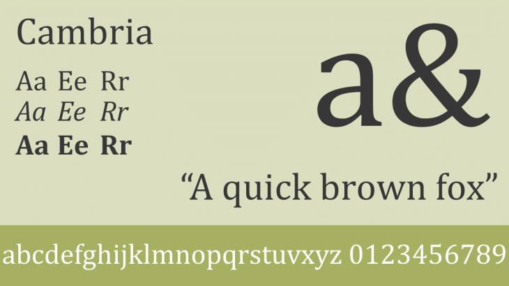
Cambria
Cambria is a serif font designed by Jelle Bosma and replaced Times New Roman as the standard body font in Microsoft Word before Calibri became the default font for both headings and body text. A fun detail about Cambria – it has a square full stop and not a round full stop. Cambria has relatively strong diagonal and vertical serifs but small horizontal serifs. Cambria could be said to be a more “sturdy” font compared to Calibri, which can pass as more “casual”.
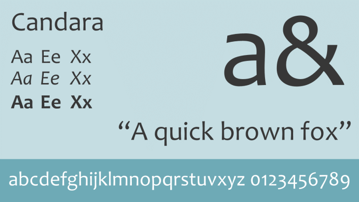
Candara
Candara is a humanist sans-serif font designed by Gary Munch. A humanist sans-serif has calligraphic influences. Candara has curvy diagonals (see the letter x) and has similar spacing as Corbel and Calibri. The curviness of the font gives it a lot of personality compared to the other “C-fonts” – which can be both good or bad.
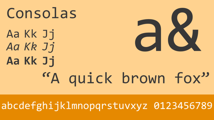
Consolas
Consolas is a monospaced typeface designed by Lucas de Groot. A monospaced typeface has the same horizontal space for every letter (and m and an i takes up the same amount of space). It is designed to be used mainly for code and math rather than being be used for large size text in PowerPoint. Its letter shapes are similar to Lucida Console (also one of the 40-something “safe fonts”). Another “safe” monospace font is Courier New.
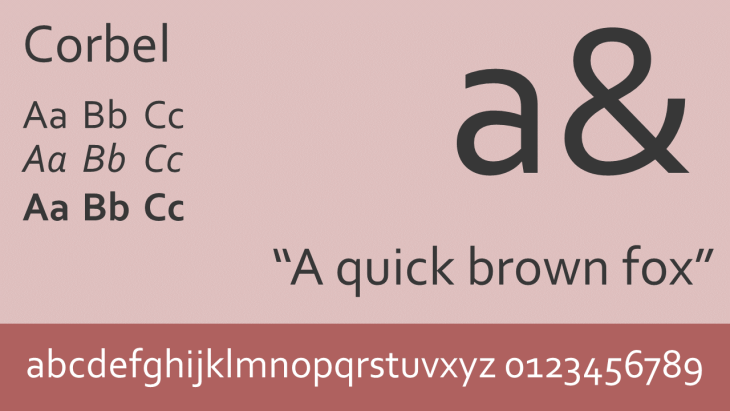
Corbel
Corbel is a sans-serif font, and like Candara and Calibri, it is a humanist font. PowerPoint creators should note that a distinctive characteristic of Corbel is that its numbers are rendered as lowercase numerals, which is fairly uncommon for sans-serif faces. You either like that or not. Corbel is similar to the well-known font Frutiger and is probably the C-font that is the best alternative to the previous standard sans-serif font Arial (if you can live with the lower case numerals).
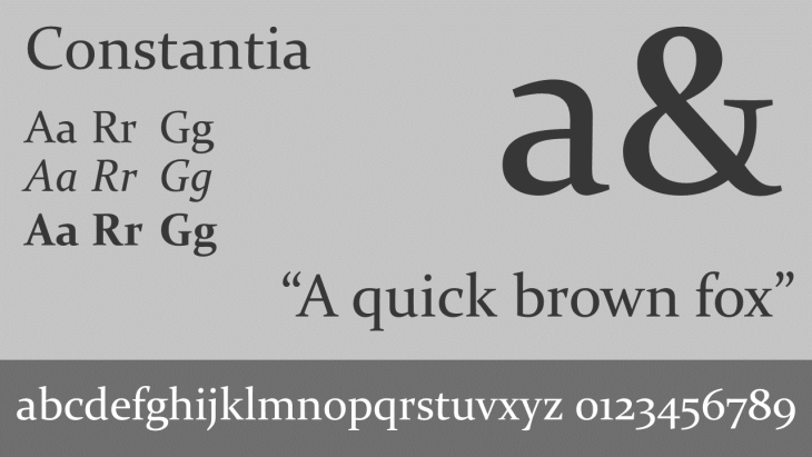
Constantia
Constantia is a transitional serif typeface designed by John Hudson, designed with almost triangular serifs. A transitional typeface has more pronounced differences between thick and thin lines than old style typefaces. Times New Roman, the previous standard serif typeface, is also a transitional serif typeface. Constantia’s numbers are text figures (lowercase numerals) just like Corbel (and the “safe” font serif font Georgia).
Google Slide users
If you want your PowerPoint to translate well to online services, Calibri, Cambria and Consolas are available in Google Slides (but not Corbel, Constantia and Candara are not).
Of these six fonts, Corbel is our favorite sans-serif font and Constantia is our favorite serif fonts, even though we dislike the text figure numbers. All of the fonts are safe to use in your next PowerPoint – anyone with any version of PowerPoint on any system will be able to open your PowerPoint and they will show correctly and the way you intended.
Leave a Reply