How much time do your employees and co-workers spend creating and updating PowerPoints every day? With millions of users of PowerPoint, a lot of time in the business world is spent creating and using PowerPoints. Is your PowerPoint template correctly defined or does it cause a lot of daily headaches for users, contributing to organizational inefficiency?
A PowerPoint template is a silent and powerful engine that works in the background, making it easy to create good looking and brand compliant slides in a timely manner. A correctly defined PowerPoint template file needs a defined Master slide, theme fonts, a custom color scheme and formatted slide layouts. If any of these four aspects of a template is not defined, your PowerPoint template might be a time thief as well as the cause of less appealing slide content in your organization.
What are the five crucial parts of a correctly defined PowerPoint template?
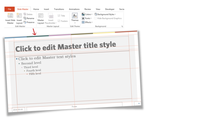
1. A defined Master slide
The most important part of a PowerPoint template is the Master slide. The Master slide is the top slide you see when you open the presentation’s Slide Master View. This is where you would add a logo or any graphics you want repeated on all slides, set the background for all the individual slide layouts, decide if your headlines should be all capitalized, what your bullets should look like, the spacing of text, where your footers and slide numbers should be placed etc. If these things are not defined on the slide Master, it has to be done manually on each slide layout and the template has lost the capability to truly rule the content added, which is really the beauty of using a template. And importing slides from outside your organization will become a hassle.
Unfortunately, we see so many “template files” with an empty Master slide, where all formatting has been done on the individual slide layouts. An incorrectly defined Master slide will make a PowerPoint more time consuming and less efficient to use for users.
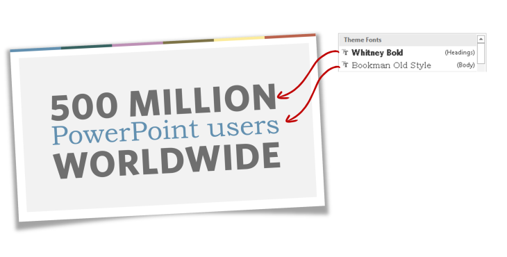
2. Defined Theme Font
PowerPoint comes with the capability to define theme fonts – a font for headings and a font for the body text. The theme fonts automatically define the text in any placeholder, graph, text box, SmartArt etc in a presentation. The theme fonts that have been defined for a presentation can be seen at the top of the font menu on the Home tab.
The default font setting in PowerPoint (from 2010 and later) is Calibri. If the theme fonts have not been defined or used for text in all placeholders, any text the user adds to the slides (like a floating text box) or any slides imported to the template will use Calibri, as that is still the theme font for the template. However, if the template uses the theme fonts setting correctly – your presentation will stay brand compliant using your corporate font (which most likely is not the standard Calibri) throughout your presentation.
CLICK TO READ MORE ABOUT FONTS
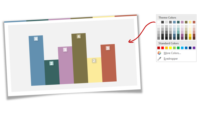
3. Defined Theme Colors
A PowerPoint file comes with 10 colors defined (+2 colors for hyperlinks). If you don’t define your custom colors for your template, your created graphics in PowerPoint (graphs, SmartArt, tables) will use the default Microsoft colors. This means that even though you might have added background graphics such as a logo to your slide Master in your corporate red color, if this red color has not been added to your slide template’s theme colors, the user of the template will not have access to that red color for any other graphics.
We’ve seen great, beautiful designed “templates” using corporate colors for the background graphics but in which the PowerPoint color theme has not been defined with these corporate colors.
CLICK TO READ MORE ABOUT TEMPLATE COLORS
4. Theme Effects
PowerPoint comes with a set of theme effects that can be applied to a file or a template. The theme effects influences fills, lines, shadows, bevels and special effects of graphic objects created in PowerPoint. PowerPoint 2013 and 2016 comes with 15 effect themes (PowerPoint 2010 has 40!), each with a different set of effects. Once applied, the variants of that effect theme is available to the users when they are creating shapes, tables, SmartArt and charts so make sure you have applied an effect theme where all variants in the effect theme fit your brand.
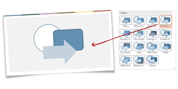
CLICK TO READ MORE ABOUT EFFECTS
5. Empty and custom slide layouts
A raw PowerPoint file consists of 9 standard slide layouts. How headlines and text in placeholders are formatted on these slide layouts depends on the settings on the Master slide. You can add custom slide layouts in addition to the 9 standard layouts – and you should. The 9 standard slide layouts often do not cover the main ways users create slides. You might want an agenda slide, a team slide with photo placeholders, or end slide with contact information. You don’t want your users to constantly create their own versions of commonly used slides.
You can also add multiple masters with different backgrounds to a template, like a Master with a dark background to complement a daily used light background.
A slide layout can have different types of placeholders (multipurpose, text, image, graphs, table etc). These placeholders should be empty of text except the short, instructional help text that will disappear when you click on the placeholder to add text (or an image, table etc depending on the type of placeholder). This help text is defined in the individual placeholders on each slide layout in the master.
Good practice is to create a separate PowerPoint “user handbook” where the template and its usage is presented with instructions, maybe with slide layouts filled with “lorem ipsum” text to show how text should be placed. The actual template and its placeholders should be left empty and ready to use.
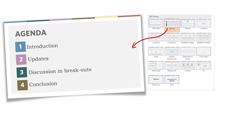
The final template
A real template has a correctly defined master slide, defined headings and body fonts, 10 defined corporate colors and empty slide layouts, all nicely packaged and saved as a .potx file with a preserved Master saved as a theme (.thmx).

Leave a Reply