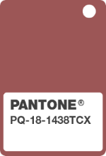
 Pantone, the global authority on color, has introduced Marsala as the color of the year 2015. Pantone describes Marsala as an earthy shade with a bit of sophistication and says that “Marsala enriches our mind, body and soul, exuding confidence and stability. Marsala is a subtly seductive shade, one that draws us into its embracing warmth”.
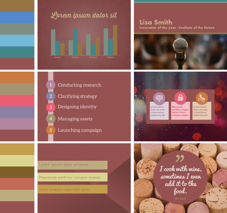
We had to try it out for presentation design and based on Pantone’s color paring suggestions, we have created 3 color themes for presentations using PowerPoint’s color system (six accent colors, two dark, two light colors).

Marsala is a very earthy and rich color and you can use it to create beautiful warm color themes. Maybe the color will be a bit tricky to display on a projector with low light and hopefully office printers can give justice to its musty wine color (and not make it too brown).
We had a lot of fun playing around with Marsala and have added the color themes in a SlideShare presentation for you to enjoy.
Read more about Marsala at Pantone.com
Leave a Reply