The concept of Death by PowerPoint has largely been blamed on the over use of bullets in presentations. It’s somewhat sad as bullets are a great way to organize content and create a structure. If you are structuring a to-do list for your next project – you will most likely use bullets as an organizing tool. The problem is as great as bullets are for organizing and structure content, bullets are not in their basic form a very great tool for presenting content, however organized.
But sometimes you are stuck. You can’t shorten your content (maybe for legal or other reasons it all has to stay). There is no time or budget to go back to the drawing board and create a visually stunning presentations. You are forced to work in a template that is only beneficial to infinite bullet slides.
How can you avoid people dying of your bullets?
These are 10 techniques to use on your slides if you are stuck with the bullets, and a way to minimize the chance your audience will fall asleep…
Let’s say we have to present this text about the benefits of using a calendar and we have to use all the text as commanded by a very evil and bullet prone boss (who really, really likes planners).
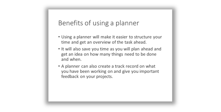
1. Highlight
If you are stuck with a corporate template that uses bullets – you can try to highlight the most important part of your bullet points. Use a bold version of your font on the key word or key concept of each paragraph. Make sure what you highlight is one or no more than a few words – your text heavy slides will be even harder to read if large chunks of it are highlighted. Use spacing to give some air between the paragraphs between the bullets to make it easier to separate them. If you have some space between the bullets – you can even increase the bullet size and tone down the color to make the bullet more like part of the paragraph. Or you can move your bullets all together (but still keep the text intact) – the increased spacing will do the job for you.
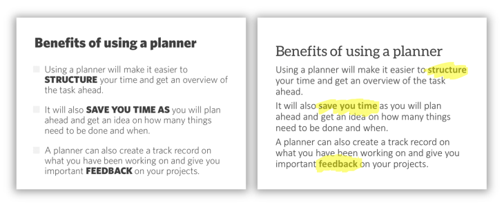
2. Split
If you can deviate from your standard template but still need to present the text in all your bullets – consider splitting the text in each bullet into individual slides. With less text on each slide, the font can be larger. Still consider to use some kind of highlight (it is still a lot of text) – or add a title row to make it easier for the audience to see what you want to emphasize. You will have more slides – but you are using the spacing more wisely and you are not overloading your audience with all the text st once.

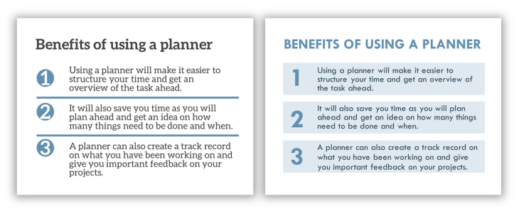
3. Overemphasize
If you really have to keep your text and your bullets on one slide – try to “over do” it. Make the bullets graphic elements by themselves and work with lines, shapes and spacing to separate the bullet points. It is still a lot of text on your slides – but at least they are visually separated and it is a little bit easier for the audience to follow along.
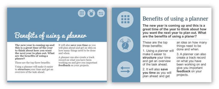
4. Iconify
Icons are great visuals and tricky visuals at the same time. On one hand they are a great way to add visuals to a slide with lots of text. An icon is a simple visual that can fit in small spaces, unlike images that usually needs more space. On the other hand, not all icons are easily understood without context and often need a text label. That said, adding an icon to emphasize your bulleted text can make it easier for the audience to take it in – and you can reuse the icons later in your presentation to create a theme throughout your presentation slides.
![]()
5. Slideument
If you know that you are not going to present your slides and they are actually more of a document (hello all consultants!) to be distributed rather than presented – create a slideument from the start and maybe even add more explanatory text to your bullets to make sure they really stand on their own for the audience reading them. A slideument is a slide that is a document and not meant to be presented on the screen. This means you can actually decrease the text size and use the whole canvas, add more headers and work with spacing and columns to present your bullet points more in a magazine/print layout. You can even add more explanatory text to make sure the slides stand on their own as you will not be there presenting the information.
6. Chunking
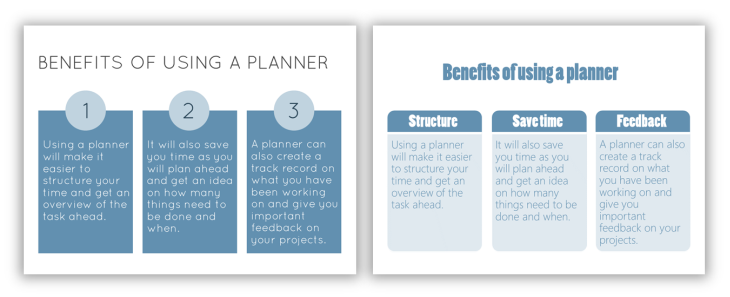
Just like overemphasizing a paragraph on a slide, you can “chunk” your bullets into shapes to make it easier for audience’s eyes than rows text. You can chunk your text vertical or horizontal – depending you how much content you have. Use shapes to separate the text and add numbers, headlines or icons to each chunk of text depending on the type of content you have. Sometimes you have a sequel of step (use numbers), sometimes you have different parts to a process (use text or icons).
7. Tablify
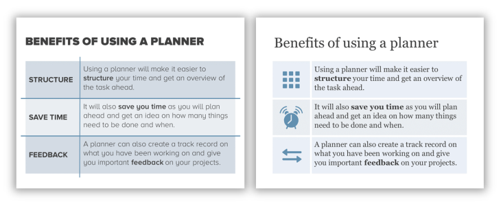
One easy and quick way to divide your text in more clear parts on your slide is to use a simple table. A table has rows and columns that you can shade. You can use contrasting lines between the cells to add to the visual effect. Bullets on a standard slide can easily be converted to a table and you can then add rows/columns and use for a headline or an icon. Add cell spacing to create more air in your table to add to the visual separation of the text.
8. Quote
Another way to get away with a lot of text on a slide is to let some tell a story – it is way more “natural” to have more text if it feels like a quote and something someone is saying. Add an appropriate image of a person (think about gender, environment etc) or an icon of a person (to avoid attention to the actual persons) and add shapes or speech bubbles with your text inside. Still try to emphasize a keyword in each of the text shapes to make it a little bit easier to make sense of all the text. The text will be very small – so it works better in some settings – like a small conference room or in a slideument – probably not in a keynote setting with part of the audience far away.

9. Handout
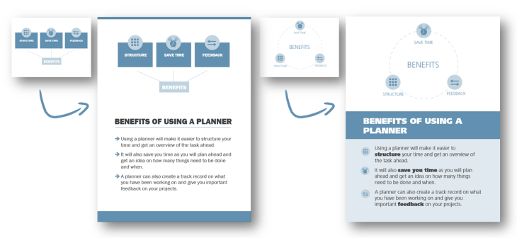
Identify the minimum amount of text from your bullets (think one-word-headline) and create a visual slide. Show this visual slide during your presentation and push the rest of the text to the Notes Page and create a handout inside PowerPoint. A handout can easily be created using the Notes Page function – where your slide will be a fixed image and you can add and edit text. So the slide you showed your audience is the visual element and the full bullet-text is the main copy on the Note Page. This way you still give away the whole text – you just don’t present it on the slide.
10. Smartart
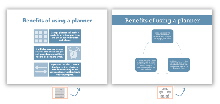
SmartArt is meant to be a way to quickly create a visual inside PowerPoint – like a process, cycle, list, or hierarchy. However, the SmartArt engine is somewhat clunky and should be used with caution. It is meant to automatically adjust the graphic and your text – but you loose some control over the formatting and it can end up being more messy. But you can be inspired by SmartArt (and you can always transform it to textboxes and graphic objects for you to edit in more detail) – and it can be a quick way to break up bullets. But be careful!
After using any of the 10 techniques to break apart your bullet slides – your audience is still alive and kicking. And maybe your bullet-prone boss got some inspiration on how to create more visually interesting slides and next time she or he is ready to start from scratch and let you create great, inspiring content without using bullets.
Leave a Reply