When PowerPoint 2013 came along, the size of the default presentation changed from 4:3 to 16:9. So – what size should you use for your slides? This is a quick guide to choosing the right size – and a brief explanation of the difference between the sizes in different versions of PowerPoint.
Why is there even different sizes of slides? The 4:3 slide dimension is the historical size – it stems from the age of analog TV screens and was the standard screen size up until about 10 years ago when widescreens started to become a more common size for TVs and computer screens. The last couple of years, the two slide sizes have started to be used side by side – with different consequences.
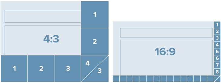
“4:3” and “16:9” refers to the aspect ratio of the slide. But the actual size of a slide with the same aspect ratio can differ. A 4:3 slide is 33% wider than it is high. A 16:9 slide is 78% wider than it is high.

So what slide size should you use for a presentation? It really depends on what you are trying to create – and partly personal preference.
Here are some scenarios:
- Use 4:3 if your are creating multi-purpose content that is going to be shown across different platforms and to be printed as documentation
- Use 16:9 if you are creating highly visual content that is only going to be shown on a screen – for a keynote or a conference presentation.
- Use 4:3/Letter/A4 size for content that is only going to be distributed/printed as a sliduement and never really to be shown on a screen.
- Use 4:3 for content created for specific platforms that shows best in 4:3 such as Slideshare and iPads.
- Use 16:9 when creating content for specific platforms that shows best in 16:9 such YouTube and widescreens.
- Use 4:3 for content created in an environment where most current presentations and the main organizational template in use is 4:3.
- Use 16:9 for content created for an environment where the other presentations are created in 16:9.
In general, 4:3-slides works for most projectors BUT when projected on LCD screens, the slide will not fill the screen and you might have black bars on the sides of the slide or the content will stretch and be distorted. 16:9-slides works for projectors, LCD screens and widescreen projectors (most boardroom projector shows 16:9).
Regardless of what size you are using – always make sure you plan ahead and are familiar with the settings on the computer being used to project and what aspect ratio a specific projector (or webinar system if you are presenting online) can support.
The “new” 16:9 size
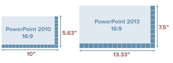
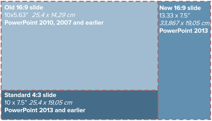
In PowerPoint 2013 a 16:9 slide has a different size compared to PowerPoint 2010. The standard size for a 16:9 slide changed from 10×5.63″ in PowerPoint 2010 to 13.33×7.5″ in PowerPoint 2013 (the aspect ratio is still the same – but the size changed).

What does the difference really mean for a PowerPoint user designing slides and redesigning older slide decks? If you had content on a 4:3 slide, which as been a standard for so many years, in PowerPoint 2010 and changed it to a 16:9 slide, your content had to be resized and repositioned, which is a time-consuming hassle.

In PowerPoint 2013, if you take your content from a 4:3 slide and move it to a 16:9 slide, the content will fit better on the slide, which means it is easier to change the size of your presentation (not that you want to sit and do this manually – you really want to design for the right slide size from the start – but you know – in case of a presentation emergency or when merging decks with different sizes).

If you are still working in previous versions of PowerPoint, you can still use the “new” 16:9 size. Just set the custom size for your presentation to 13.33” (width) and 7.5” (height) in Slide Size menu on the Design Tab, and voila, you are working in the future!
And – if you are creating a presentation template for your organization – plan ahead and create both a 4:3 and a 16:9 template so users can choose the appropriate one.
In sum – these are the relationships between the different PowerPoint sizes.

(image inspired by Echo Swinford of EchosVoice)
Leave a Reply